Joe Simmons
Case Study | Octopus Hydrogen | Website & Brand
Website and brand for Octopus Energy’s hydrogen venture

Introduction
A bold identity for a new market.
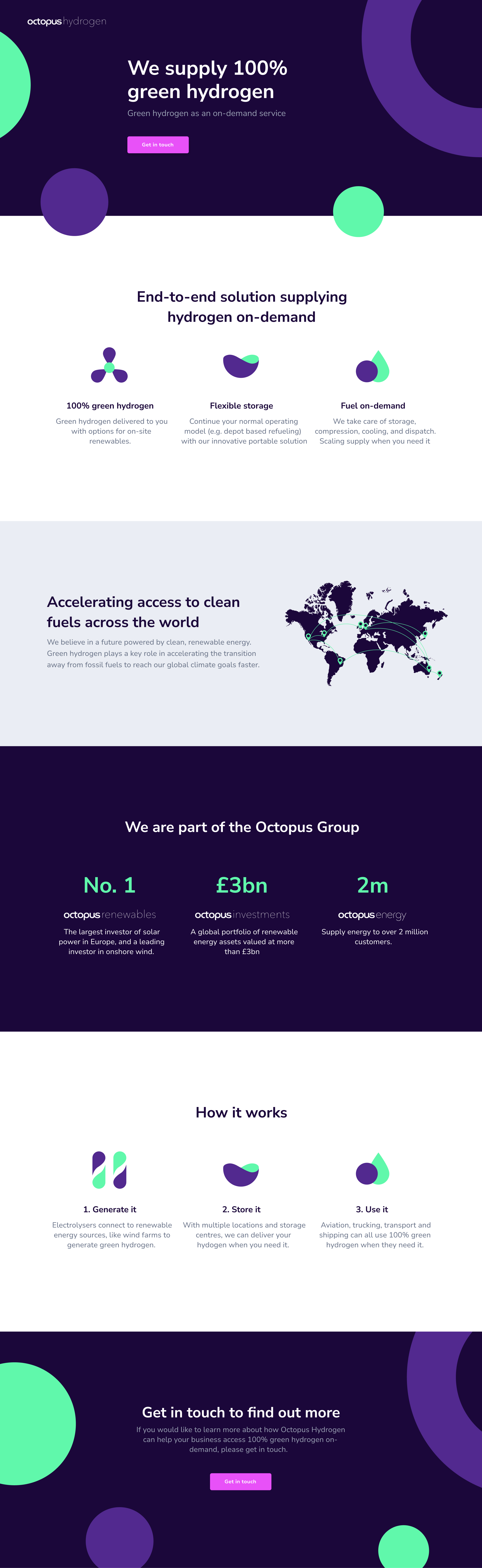
Octopus Energy’s Hatchery had validated a big idea: green hydrogen, delivered on demand. It needed a brand and website to match. Fresh enough to feel like a new, innovative clean-energy startup, familiar enough to belong to the Octopus family.
I created the brand identity, the colour scheme, a custom icon set, and the website itself, from first concept through to launch.




Branding
Fresh enough to stand out, familiar enough to belong.
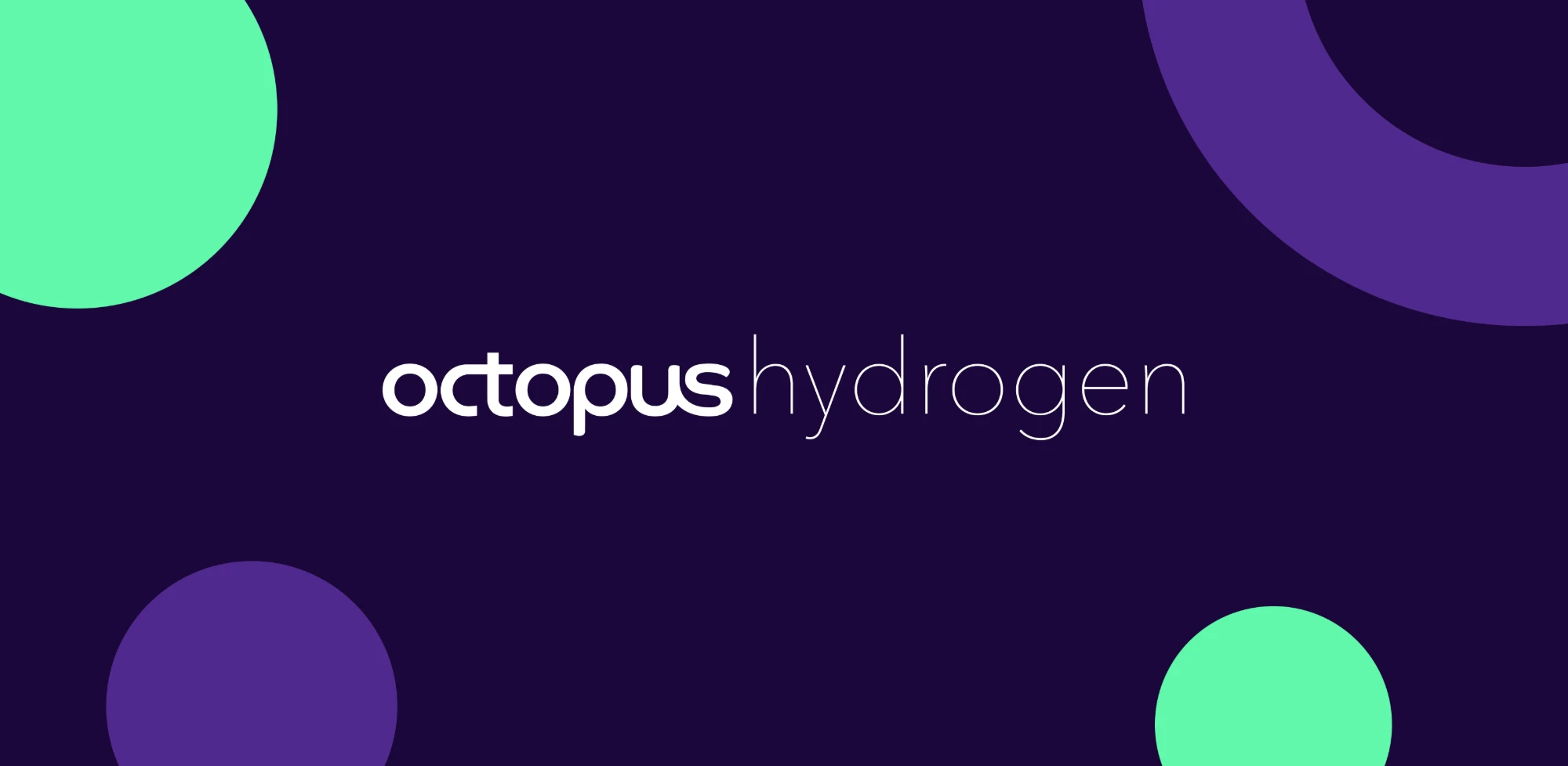
The identity builds on Octopus Energy’s signature purple, then pushes somewhere new, with an electric green and rounded, organic shapes that feel more futuristic and tech-led. The custom icons follow the same rules, turning an abstract product into a set of marks that are simple, friendly and instantly readable.
Colour palette
- #2A0A4EDeep Purple
- #6A2BD9Electric Violet
- #C42FD6Magenta
- #4FE3A2Mint Green
- #F3F2F8Off White
Custom icons





The outcome
A full identity, and a £38m raise.
The full brand, custom icon set and website shipped as Octopus Hydrogen’s public identity, built end to end by one designer.
With a distinctive, market-ready identity behind it, the venture raised £38m in investment: the momentum to take green-hydrogen-on-demand to market.